Your Own Piece Of The Rainbow: Painting a Room Using Two Different Colors
Painting a room is a fun and interesting challenge that will allow you to flex your creative muscles in a variety of ways. Your first step will be deciding on your colors.
This can get a bit tricky, as you’ll have endless options to choose from, and it might be difficult to visualize the final result as you’re going over swatches. That’s why interior decorators turn to the color wheel when deciding on paint styles for a room.
Choosing Your Colors: Bold Contrasts or Complementing Shades
There are three types of complementary color combinations: contrasts, splits, and analogous.
Contrasts feature two colors on opposite sides of the color wheel, such as violet and yellow, orange and blue, or green and red.
Split color combos feature two colors that aren’t quite opposite on the wheel but close to it. For example, the basic split colors for violet would be orange yellow and yellow green. Split colors create an interesting look that’s a bit softer than an opposite contrast but still quite noticeable.
Analogous colors are close to each other on the color wheel. An example would be true blue and aqua blue. This is a good option if you’re set on a certain color for a room but would still like to create depth and interest.
Research has shown that color can have a strong effect on mood, so the activities you plan on doing in the room you’ll be painting should be factored into your decision.
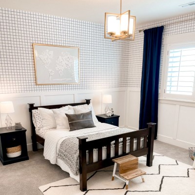
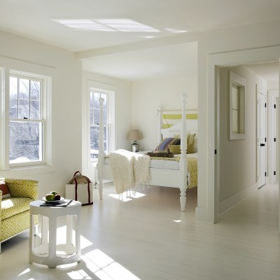
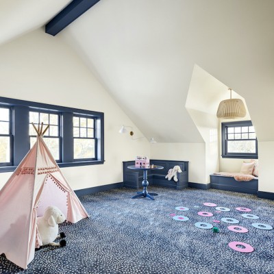
The color blue has been shown to be calming, making it a good choice for a bedroom. Red is known to evoke passion and emotion, which means it might be a better choice as an accent color versus the main color in the room.
If you tend to get down in the dumps, consider going with two shades of yellow, which has been shown to increase happiness.
Two-color Combos: What to Paint and How
Now that you’ve picked your colors, you get to decide how to use them! Once again, there are practically endless options to choose from.
1. Accent Walls or Ceilings
An accent wall draws the eye to one point in the room, which allows you to feature artwork, photo collections or anything else you like. It also allows you to use a bright color, such as yellow or red, without it overwhelming the entire space.
If you don’t want to do an accent wall, an accent ceiling is another fun option.
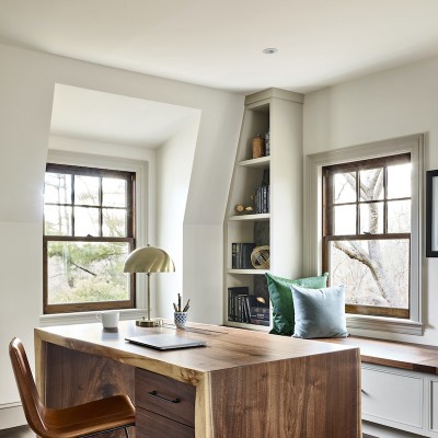
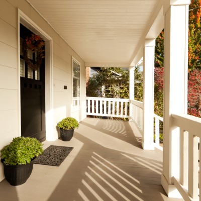
2. Painting with the Architecture
If your room features interesting architecture, such as moldings, wainscoting or chair rails, you can use these shapes as the base for your two-toned color design. Choosing a subtle color for walls and a brighter color for all of the features is a great way to draw attention to these accents. You can also focus on a single feature, such as a built-in bookshelf or mantle, to provide a pop of color that benefits the room in the same way an accent wall would.
3. Texture Painting and Stenciling
Choosing a two-color look for your room doesn’t necessarily mean you have to put each color in a separate place. If you want to create gorgeous depth and texture, try painting your walls in one color and using sponges to lightly layer the second color on top. Another fun option is to use stencils. Choose analogous colors for a subtle design, or go with a bold contrast to really draw attention to your pattern.
If you have any questions about the painting process or the benefits of choosing our low-VOC paints, please contact us today. We are glad to help in any way that we can.


