A Charming Chartreuse Nursery Design Board
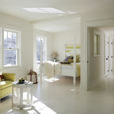
Many people shy away from bright colors – it can be an intimidating commitment! But, we're here to say, "don't fear being bold!" Done right, bold colors can create a memorable room that creates just the right impact – not too much, not too little. Today's example from Esther of Buy Modern Baby is definitive proof. Check out this charming chartreuse nursery design board.
Esther says, "I was looking for a shade of green from Lullaby Paints for our first nursery board of the spring and from the swatches on their website, Citron jumped out at me. You might be intimidated by this bright, bold green but I did my son’s toddler room with a similar shade so I know from experience that with enough light and white in the room, it’s a very livable and pleasant color! The only problem I had with Citron was that on different websites, the color looked very different so I wasn’t sure exactly which shade I’d be working with. This can happen a lot when looking at colors on your computer monitor, so before you ever finalize your paint choices, get an actual sample and try it in the space where you’ll be using it. This is the only accurate way to find out how a paint shade will look under the lighting conditions in your home." Excellent advice, Esther!
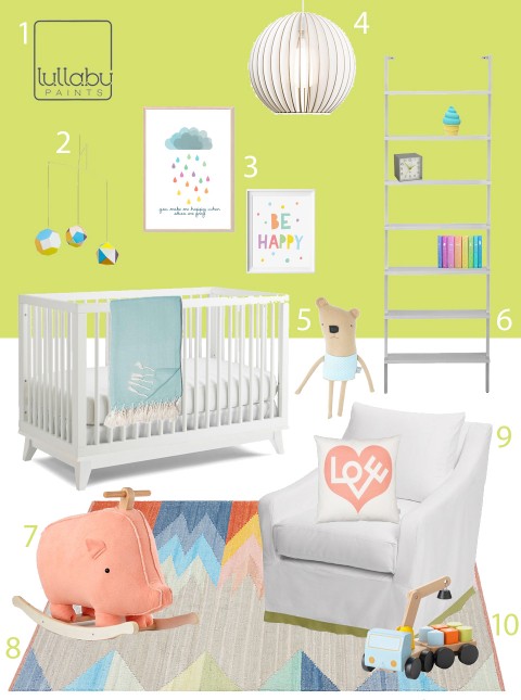
Find details about the items featured here on Buy Modern Baby.
If you love the look of the board but want to see more decor and furnishing options, check out the Citron Nursery Inspiration Pin Board for more ideas.”
Follow Esther @ buymodernbaby's board Citron Nursery Inspiration on Pinterest.
