How to Choose A Paint Color
Choosing the right paint color can be daunting with so many options. Whether you're refreshing a single room or painting your entire home, the right shade can transform a space. To help you make the best decision, it's important to consider several key factors, including your existing furniture, lighting, and the overall mood you want to create.
In this guide, we'll walk you through the essential steps for selecting the perfect paint color, from understanding color psychology to choosing the right finish for your walls. With these tips, you'll be well on your way to creating a space that feels just right.
Think about your existing furniture and accessories
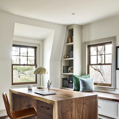
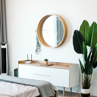
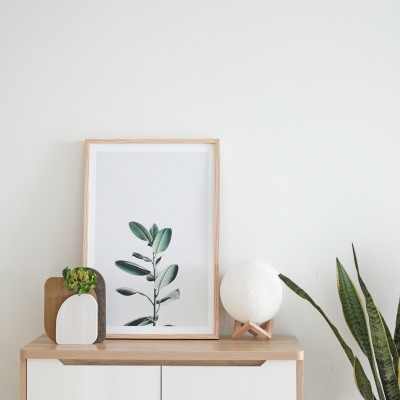
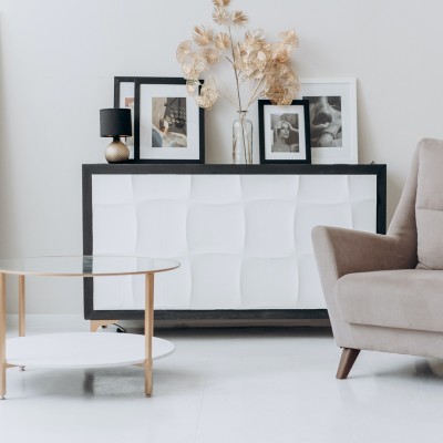
Paint color choices can feel limitless. We recommend narrowing your options by looking at your existing furniture and fabric colors. These elements are already part of the room's overall aesthetic, so incorporating them into your color choice can create a cohesive and harmonious look. Favorite rugs, pillows, or accessories can act as a color palette and help you find the perfect paint color.
For example, if you have a bold, patterned rug with vibrant colors, you might want to opt for a more neutral wall color to allow the rug to stand out. Alternatively, if your furniture is neutral, use a bolder wall color to create contrast and visual interest.
Look to current trends and design ideas for inspiration
If you're feeling overwhelmed by the multitude of color options, current trends and design ideas can serve as helpful inspiration. While it's important to choose colors that resonate with your personal taste, exploring popular design trends can give you a sense of what's fresh and stylish.
- Use darker colors on floors, then progressively lighter colors as you move up the walls to the ceiling
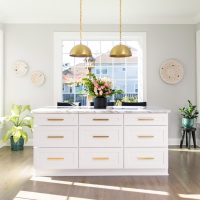
- Stick with neutrals, but don't be afraid to go bold with color when creating focal points
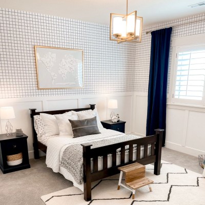
- Consider the combination of colors in designer collections, but try not to combine more than three colors.

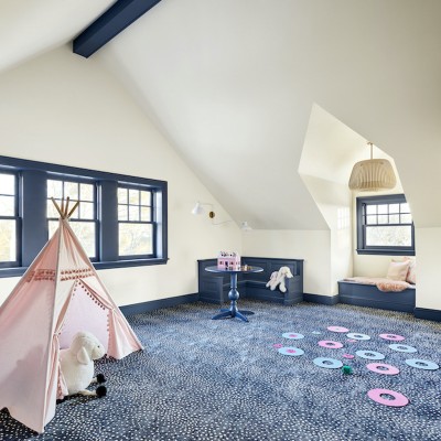
Consider adjacent spaces
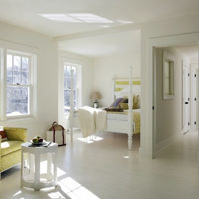
You don't have to create a color theme throughout your home, but you should be mindful of adjacent spaces. This often means considering a shade or two lighter or darker for adjacent rooms.
For example, if your living room has a warm, earthy tone, consider using a slightly lighter or darker version of that color in the hallway or adjoining dining room to create a smooth transition between the spaces. This subtle shift in color can help the rooms feel linked without being monotonous.
If you're choosing bold or contrasting colors for different areas, make sure that they work together in the broader context of your home's layout. Even small adjustments in tone—such as using a lighter shade of color for one room—can help adjacent spaces feel connected and thoughtfully designed.
Understand color psychology
Color has a profound impact on the mood and atmosphere of a room. When selecting a paint color, it's important to consider the emotions and feelings you want to evoke in the space.
For example, neutral colors like grays, beiges, and whites provide a versatile backdrop that allows you to easily change the look and feel of the room with different accessories or by adding an accent wall or trim in a contrasting color. This flexibility makes neutral shades ideal for spaces that need to adapt to different seasons or design updates.
On the other hand, lighter shades of blues, lavenders, pinks, and soft yellows are known to create a serene and restful environment—perfect for bedrooms, bathrooms, or any space where tranquility is key.
If you're looking to inject energy and vibrancy into a room, consider richer, bolder colors like deep reds, oranges, golds, or purples. These colors are stimulating and can promote a sense of excitement or warmth.
Understanding the emotional effects of color can help guide your choices and create a space that perfectly matches the vibe you want, whether calm, peaceful, lively, or energetic.

Look at the lighting
Lighting is one of the most important factors to consider when choosing a paint color, as it can dramatically alter the way a color appears in a room. Natural light, in particular, plays a significant role in how colors are perceived. Rooms that receive light from the north tend to have cooler, bluer tones, which can make colors appear more subdued or even slightly grayish. In contrast, south-facing rooms typically receive warmer light, which has a yellow or orange undertone, making colors appear richer and more vibrant. It's crucial to test your paint samples in the actual lighting conditions of the room before making a final decision.
Other important paint considerations
There are other things to consider outside of choosing the paint color itself, these considerations can affect the final look of your walls.
Know the undertone
When you're picking colors, especially neutrals, consider the undertone or the paint's underlying color. Use the "Fan Deck View" in our color library to see an electronic version of our fan deck and look at the darkest color on a strip of related colors - this will give you the undertone.
Pick the right finish
The finish or sheen of your paint is just as important as the color itself, as it can dramatically alter the final appearance and durability of your walls. Different finishes are suitable for different spaces and uses, so understanding their properties will help you select the right one for your needs.
Here are some general guidelines for the different finish types:
- Matte: Lowest sheen, ideal for low-traffic areas like living rooms and bedrooms, as well as ceilings.
- Eggshell: Has a bit more sheen than Matte and works well in high-traffic areas or areas that have moisture. It's also washable, making it perfect for kitchens and bathrooms.
- Semi-Gloss: Has a muted shine. Our most popular choice for cabinets, furniture and trim.
- Gloss: Shiny! Perfect for high-use surfaces, like a railing or furniture.
Remember, low sheen paints (Matte and Eggshell) tend to hide imperfections in the painted surface, while glossy paints will accentuate any flaws in the surface.

Get a color card, swatch, or sample first
Color cards will give you a good idea of the range of colors you want to choose from. But, a paint sample is even more useful. If you paint a sample board, you can look at the board in different lighting and hold it up against your furniture. For our designer collection, Lisa Tharp Colors, we also offer 9”x10" removable, real paint wall swatches, making it even easier to find your perfect color.
You have a wide range of color choices - on top of our 1,300 ECOS colors, we can also color match any other manufacturer's colors. If you need help with your color choices, contact our customer support team by phone, chat or email.

Create Your Ideal Space With ECOS Paints
Choosing the perfect paint color for your space is an exciting and thoughtful process. By considering factors like your existing furniture, accessories, and the emotional impact of color, you can create a space that truly reflects your style and enhances the mood you want to evoke. With these guidelines in mind, you'll be well-equipped to select a paint color that not only complements your existing decor but also creates the perfect atmosphere in every room of your home.
Looking for paint colors that will enhance your home while keeping your space non-toxic? Check out our collection of interior and exterior paints to get started. Happy painting!